Processing: How David Small Illustrated and Wrote The Werewolf at Dusk
The artist on weird fiction, the appeal of giant monsters, and illustrating short stories.
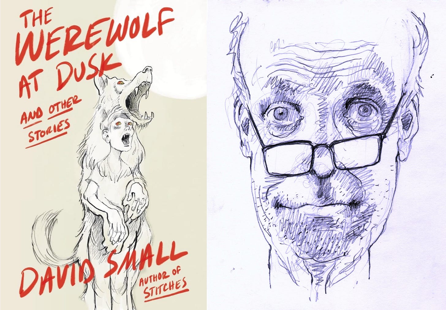
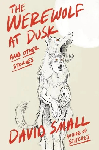
On a semi-regular basis, I interview authors about their writing processes and the craft behind their books. You can find previous entries here. This week I’m excited to be talking with the award-winning writer and illustrator David Small, whose recent and excellent illustrated book of dark stories, The Werewolf at Dusk, is a perfect Halloween read for any graphic novel fan. The Werewolf at Dusk is a collection of three eerie tales all illustrated by Small in his expressive and emotive style. I’m admittedly biased toward the book as one of the three illustrated stories is my own—the others are by Jean Ferry and David Small himself—and it was an extreme thrill to see my story expanded and improved with Small’s haunting and lovely illustrations. But even if that wasn’t the case, I’d love this collection that combines two of my favorite art forms: graphic novels and weird fiction. I talked with Small over email about horror, the appeal of giant monsters, and illustrating short stories.
All three stories in The Werewolf at Dusk are about beasts in varying forms and all three might be called horror or perhaps “weird fiction.” What attracts you to these kinds of eerie, surreal stories?
It’s probably something completely prosaic, like the old saw “scary movies give form to our private fears.” I had plenty of private fears as a kid that I needed to give form to.
Now that I think about it, I remember cutting classes in high school and going to the movies whenever there was a new monster movie in town. (I was attending Cass Tech then, which was in downtown Detroit, with its multiple movie palaces, easy to walk to.)
I was full of concealed rage as a teen, and I think I identified more with the giant monsters in those movies than with the humans. Giant spiders, giant crabs, giant lizards, giant this and that tearing the world apart.
The movies were all terrible, but my need to see monsters wreaking havoc was insatiable.
Later on my taste in films got more refined and I came to appreciate the more subtle techniques of Hitchcock, Polanski, Bergman, and more understated forms of terror.
How did you go about picking the stories for this collection?
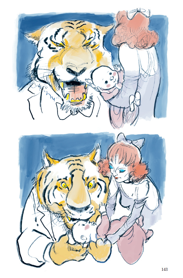
I have a collection of Surrealist short stories which I found 40 years ago or more. Most of those stories are conceived by the so-called “Automatic Writing” method popular with that group. Reading enough of that stuff killed my interest in Surrealist writing. But two of those stories stood out by virtue of their traditional structures. They had beginnings, they had middles, and they had ends. One was “The Fashionable Tiger” by Jean Ferry. (Later, I renamed my own translation of it “The Tiger in Vogue.”) The other was Leonora Carrington’s “The Debutante.”
Both stories stayed with me for nearly half a century. Occasionally I would reread them, thinking about how I might illustrate them, but also thinking there was little hope of that because, as an illustrator, I was planted firmly in children's literature. Then, in 2019 or thereabouts, with two graphic novels for adults under my belt and hoping to do a third, I hit upon the idea of a short story collection done graphically. Of course, those two stories would top the list. To make it a nice three, I added a story of my own, “A Walk in the Old City.”
The problem then was to obtain the rights to those older stories. Neither of them was in the public domain. My agent found the executors and got in touch. Ferry’s estate in Paris presented us no problem, but there was a feud going on between the two brothers in Mexico who owned the rights to their mother’s—Carrington's—work, and after a year of wrangling they denied me permission to do her story.
I was bereft. I thought my book was killed. Then, one day, while scrolling through site after site on the Internet, I came across this brilliant thing called “Moon Aches” by Lincoln Michel. If I could possibly obtain the rights to illustrate it, this story, I knew, would work even better than “The Debutante,” both stylistically and in its content.
You know the rest!
You mentioned Surrealism, and I was also curious about your relation to it. Carrington was a part of the group as you say and I know Jean Ferry’s story, while not officially Surrealist, was loved by André Breton.
Surrealism? I heard it died a long time ago! I was happy, then, when I lived in Mexico to find that Surrealism grows out of the ground down there.
I like Surrealism in the work of certain artists, in certain movies, and in a small handful of works of literature. [Cf. Anything by Kafka. Ishiguro’s The Unconsoled.]
The three tales visually cohere with your illustrations, but I was also interested in the stylistic difference between them. For example, the use of colors. The first story is almost entirely blue and red plus some flashes of yellow. The second story uses black lines with blue and white coloring. And the last story has a broader and brighter palette. There are other differences too, such as clean or fuzzy linework. I’m curious how you settled on these different visual styles. Did you know going into a story what color palette and linework you wanted to use? Or do those decisions get made during drafting?
I had planned on making a black and white book because color is always such a problem. Color yanks us to and fro, psychologically, often to the detriment of straightforward storytelling.
Then I began work on your story and a chance decision during the sketch phase changed everything. I wanted the werewolf to stand out from the rest of the figures in the frames, even when he wasn't in wolf form. So, in my original drafts I drew him in blood red. I liked it very much and it stayed, suggesting that I find other color solutions for the other two stories as well.
“A Walk” is the most somber of them all.
“The Tiger in Vogue” became full color because I wanted the feel of an old vaudeville show and I couldn’t see doing that in black and white. One notable choice was the tracking device of placing a red tie on our protagonist, making him more easily followed in the crowd at the theatre.
The second story—which you wrote as well as illustrated—creates its nightmarish reality in part by using askew angles and large swaths of black. It works fantastically to conjure the eerie atmosphere of the story. And it reminded me of German Expressionist films with heir Dutch angles and impossible, theatrical sets. Was that an influence?
German Expressionism can be very harsh. It often has knife-sharp angles. It’s very violent and forced and has limited appeal for me. I always found it, in the hands of artists like Kirshner, Heckel, and also in German films of the period, too exaggerated. I like it more for the way it has influenced some American filmmakers I admire. Charles Laughton’s Night of the Hunter for example.
As a writer, one thing I always think about is manipulating time on the page. When I’m slowing readers down or speeding a story up. Pacing, basically. Illustrations add an entire other layer of “time” because you can—as you do in these stories—include sequences of text-free pages that stretch out time in a different way. (I thought of them as “silent” pages, although that is surely a very writer-brain way to think.) How do you think about pacing when you are illustrating a narrative?
Pacing, yes. That’s a fun subject. I think having a sense of how to pace a graphic has a lot to do with music. I’m talking classical music, with its varying rhythms and changing moods. I never liked music from before the 20th Century very much. Maybe I’m just a philistine, but Beethoven, Brahms, Mozart always left me cold.
But when I was 11 or 12 , my parents took me to a performance by the Detroit Symphony, and I heard Ravel’s La Valse. I was so excited afterwards I could barely speak. (My parents, of course, hated it, which only encouraged my zeal for this music.) That piece changed my life.
I went from Ravel to Bartok and Schoenberg. I listened to everything I could lay hands on. I still seek out contemporary composers. I’m sure all this music has infected my artwork.
One simple technique in visual tempo is to slow the readers down by giving them more to look at on the page, or, conversely, speeding things up by showing them less.
For “Werewolf,” which rockets along through a whole lifetime in very few words, and which jumps forward and backward freely in time, there were only a few times I filled a page with complicated imagery.
In “A Walk in The Old City” I wanted to show outwardly the inner turmoil of my protagonist, a psychiatrist facing a crisis in his career. (It’s a catastrophe, actually, for he is losing his compassion, which spells career death for a psychiatrist.) We follow him at the very beginning as he walks through foreign alley ways. I tilt the camera up, down, sideways as he wanders, to create a feeling of instability as he becomes more and more lost.
The rhythms of the various shots, the way they work together, should create, in this case, a melody of steady foreboding which settles down at a certain point, then comes roaring back when the giant spiders reappear.
The three stories in The Werewolf at Dusk were adapted in three somewhat different ways. One story was adapted from a long-dead author (Jean Ferry), one story adapted from a living author (myself), and the third written by yourself. How different was the process of adapting them?
In “The Tiger in Vogue,” Ferry’s original story begins and ends inside a music hall. I wanted to extend this, to give more information about the protagonist’s life and more about the social conditions outside the music hall, of which the tiger itself—with its barely-constrained destructive power—is symbolic. So, respecting the original text, I have several “silent” pages in the world outside the music all before the text begins and, at the end, several more. Those are my additions to the original story and, because I didn’t want to violate Ferry’s text, they are told silently.
I don’t know if Ferry would approve my additions, were he alive, but I think he might. Respecting that we live in a different era he might agree with me that many modern readers need prompts to direct them to the Nazi era and its relation to this fable.
One thing we’ve talked about before is how many prose stories don’t lend themselves to illustrations. What qualities in a work of prose make it open to being illustrated?
I'm generally resistant to adapting stories I love because I don't want to destroy the language in them. I can’t imagine making a graphic out of anything by Henry James, for example. His plots and characters are inextricable from the granular nuances of his language. I think the same holds true to some degree for Melville, for Chekov, for Flannery O’Connor and so many other great writers. Their language makes them unique. Images would overpower their work.
I can give a perfect example of what I mean by the image overpowering the language, with dull results. In one of Flannery O'Connor's stories—I forget which—she describes a man with “a belly that overhung his belt like a sack of sugar.” This is hilarious and precisely right, but if I showed it in a picture without that description, the metaphor disappears, and we’re left with nothing but the image of a fat man.
O’Connor’s work is full of such metaphors. So, much as I’d like to turn one of her stories into a g.n., I’m not going to violate her work that way.
I imagine many of my newsletter readers are writers who are interested in collaborating on graphic novels or illustrated work. You’ve worked with many writers on various projects. What are mistakes that writers make when collaborating on graphic novels or illustrated books?
Writers for graphics should keep in mind the primacy of the visual in this genre. Like it or not, pictures have a way of getting past all the guard towers and straight inside to the heart, for good or for ill.
Another tip: don’t write out pages of directions for the artist to follow. A good graphic artist can design the sets and costumes, set the lights, establish camera angles, cast the actors and play all the parts. In general, they need to be left alone.
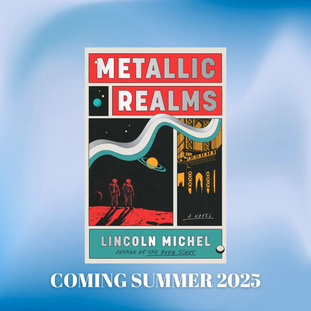
If you enjoy this newsletter, consider subscribing or checking out my recent science fiction novel The Body Scout—which The New York Times called “Timeless and original…a wild ride, sad and funny, surreal and intelligent”—or preorder my forthcoming weird-satirical-science-autofiction novel Metallic Realms.


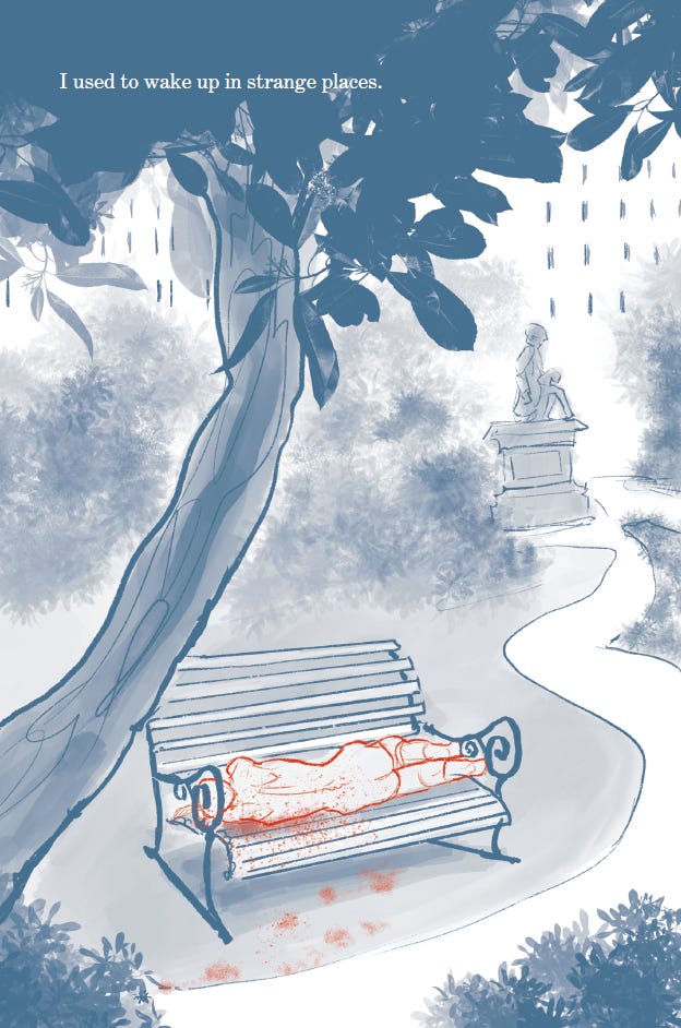
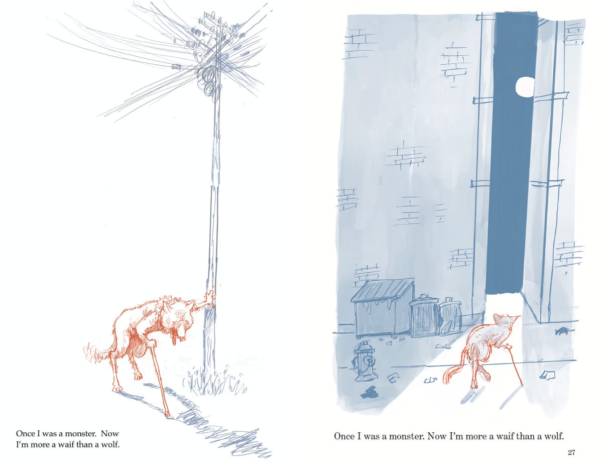
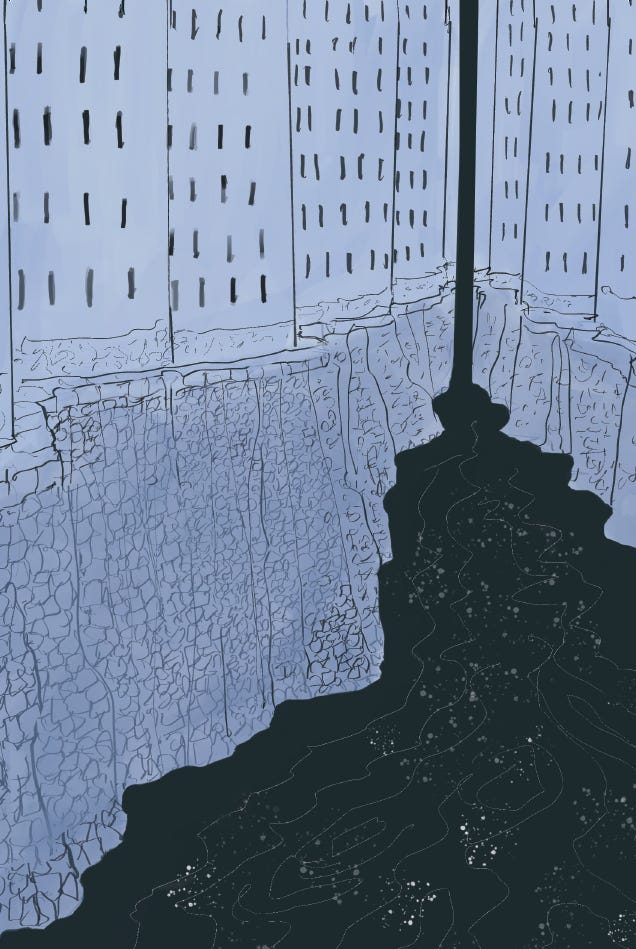
What strikes me most about these illustrations is their poignant simplicity. Of course, I'm always in awe of illustrators and the way they enhance a story.
Lincoln you must be doing something right. Small was relentless in acquiring authors he wanted.